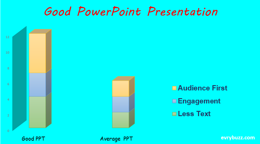
Making a Good PowerPoint Presentation might seem to be an easy task at first. But as you start preparing for it, you discover that it is not a cake walk. You have to consider all the minor details for its preparation. Now-a- days, PPT, as they call it is widely used in various forms as tutorials, presentations, etc. Here are some of the ways to make an effective and professional presentation.
The Power of Less:
Use less texts and limited images per slide
Yes this is what you should emphasize when you are making good PowerPoint presentation. Less text and limited images per slides, this is the most basic fundamental.
Too much of text can bore the reader who would not be interested in reading the whole history. Try to give a gist of the whole idea in less than a single statement. You might include subsections to a given idea but none of your ideas should look too exaggerated. The best way to do this is layout your idea either in bullets or in points.
Similarly, the usage of images should not be exceeded to more than 2 images per slide. Moreover, use images only when they convey your idea in the most effective way. Because, you see all the articles related to good PowerPoint presentation emphasizing that you should include images, does not mean that you insert images in the slide for display purpose.
Also Read: Innovative PowerPoint Presentation
Remember, good PowerPoint presentation is all about the art of presenting your idea in the most effective way, be it with texts or images. Have a look at some of the good Powerpoint presentation that and have been made so far and you will realize that the images that are portrayed in the slides convey a message/ idea for the slide which actually reduces the number of texts to be used. The most advantageous thing about using images that it creates more interest and awareness than a text can do. It is much easier to remember images and connect than texts.

Design your presentation:
Choose appropriate colors and fonts for background and text:
This is the most important factor considered for designing a presentation. It is always preferable to use lighter background and dark text. Lighter background and lighter text or dark background and dark text is a strict no-no. Be precautious of choosing the appropriate shades for background and text. The shades should be pleasant for the eyes to view. It should not create pressure on the e yes. An example of a bad combination is using white text on a light blue background.
Do not use too glossy background or backgrounds that are too loud. They create a negative impact on the reader. Instead, use smooth and pleasant colors. Font of your text is also amother important thing to consider. Too small fonts are not advisable. Use fonts with a minimum size of 20-22. Consider choosing Times Roman, Arial or Verdana for your text (these are the simplest ones?). Do not go for too stylish fonts. Keep it Simple is the thing that works for most of the professional presentation.
Be Consistent:
Do not use too many font styles and sizes on a single presentation.
It is not a good idea to use one font style for a slide and a different font style for the other. You should be consistent about the usage of the font style and sizes all throughout the presentation. Using varied sizes and font styles does not give a professional look to the slides. Similarly is the case with using the themes for your background. Microsoft has included a wide range of themes, but that does not mean that you would use all those themes in a single presentation. One single theme is enough to run for the whole of your presentation.
The Beautification: Usage of Transitions, Audios and Videos
Transition is a slide is important. By Transition, we mean to say how one slide will transit (go over) to the other slide. Will it be from left to right, right to left, up to down, down to up, etc.? Here too you will have many choices to choose from, but the professional way is to stick to the most basic ones. Too complex transition might distract the reader’s attention. They might not give attention to what is written or portrayed in the slide. Rather they will concentrate more on the transitions.
Similarly, it is always a good idea to include audios and videos but try to use not more than 1 video/audio per presentation (it might differ depending on your presentation). The disadvantage of using too many videos/ audio is that your presentation might be too large in size which might cause the system to slow down and crash.
Last Word: Think from the Audience perspective
After all audience is all that matters, so take a view of your slide from the audience’s point of view. Think what would you like in your presentation, what you would not like as a viewer. Analyze if you have not made too lengthy presentation, will it bore the audience? Prepare your speech, make sure that you are not just repeating the slides. Explain the ideas that you have presented. If your presentation and the way of presentation is good enough, you are sure to get compliments from the audience.
