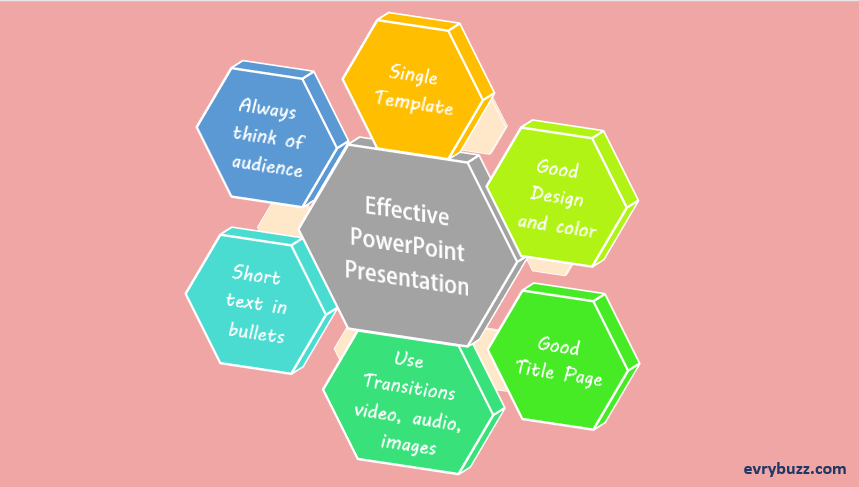
I have already written an article on How to Make a Good PowerPoint Presentation. However, in this article I have made a list of all those points which are necessary to remember while creating an effective PowerPoint Presentation. Do list out in case I have forgotten to mention some good ones……………….
Here are the Points to Remember…..
1. Essentially, use a single template for a single presentation. Do not use multiple template design in a single slide. Consistency is the key to an effective PowerPoint presentation.
2. Use standard and simple template with a decent colored background. Too many bright or glossy slides do not give a professional look. Choose colors that would appeals to the eyes.
3. Title page is very important as it creates the first impression about the whole presentation. Give a crisp title that would describe the entire presentation.
4. Try to give a table of contents at the starting of the slide so that the user knows what all is there for them.
5. Give short, direct and well structured sentences. The sentence should normally not exceed more than 2 lines of the slide.
6. Do not crowd your presentation with too much text or too much of images.
7. Give your ideas in the form of bullets or points. You may consider giving numbering in case you are explaining step by step procedure.
8. When using bullets, try using only one bullet type. Presence of the same bullet types will maintain the flow all throughout the slide.
9. Your presentation should not only be in the form texts. Convey your ideas with the help of pictures, flowcharts, audio, video, etc.
10. The Heading should have a larger font than the Text.

And it continues…….
Also read: Innovative PowerPoint Presentation
11. Choose only one main heading per page.
2. Avoid using more than two font styles. However, you may use variations such as bold, italic, underline.
13. Choose images that can convey your ideas without using text. Flooding your slides with unnecessary images would be of no good.
14. For images, using the Picture Tools tab is beneficial. Use the various selections from the Picture Shape, Picture Border and Picture Effect menus to improvise further on the images.
Note: For MS PowerPoint presentation 2007 &2010, the above tab will appear in the tool bar as soon as you click on your images.
15. Using Audio and Video is good to keep up the audience’s interest.
16. Flowcharts can be really helpful when you try to replace them with texts that have subtopics/ points in a flow.
17. Keep the simplest transition for your slides. Your motive is to keep the audience focused on what is all written in the slides.
18. Do not try to give all the explanation in the presentation. PPT is for the purpose of presenting the most important key points. Explanation should be done while communicating with the audience.
19. Always keep the last slide as a scope for discussions questions.
20. Think from the audience’s perspective.
The above are just points that should be kept in mind while preparing an effective PowerPoint Presentation (PPT).
Basic Essentials of an Effective PowerPoint Presentation:
In a gist, the basic essentials of a PPT are:
Title page
A Table of Content
Short sentences with interactive images, flowcharts, videos, etc. Keep one heading per page.
Simple transitions
Last slide for queries / discussion.
So, Go ahead and make an effective presentation!!!!!!!!!!
